Saigon Shuffle 2.0 is an updated (expanded) edition of a book we published ten years ago. My husband, Dominic Sondy, and I have been a creative team for decades and when we published the first edition, self publishing was just becoming available. This edition is a much better book on several levels: the writing (Dom) and the design (me).
The tools used had gotten better and my own skills at managing long-form publications had also improved... A LOT. An extensive amount of time was invested in preparation:
* Setting up folders
* Organizing images
* Creating master pages
* Testing character and paragraphy styles
I knew that the ebook or Kindle version follow once we had the print version completed and published. Thus, organizing my workflow and project folders would make the adaptation easier.
The ePub export from InDesign was messy and did not produce the desired results. I subsequently used Apple's iBooks Author to manage and create the digital version of the book.
Visit www.saigonshuffle.com for more about the book and link to Amazon.
InDesign tools continue to amaze and challenge my approach to publication projects. This screen shot, highlights the use of the 'book' feature. I was able to manage over 40 InDesign files that comprised this 240+page book.
Master pages are a must when working on any project. Achieving page numbering and consistency with background elements would be impossible. This simple structure with header/footer and ample ratio for margins, especially the inside margin.
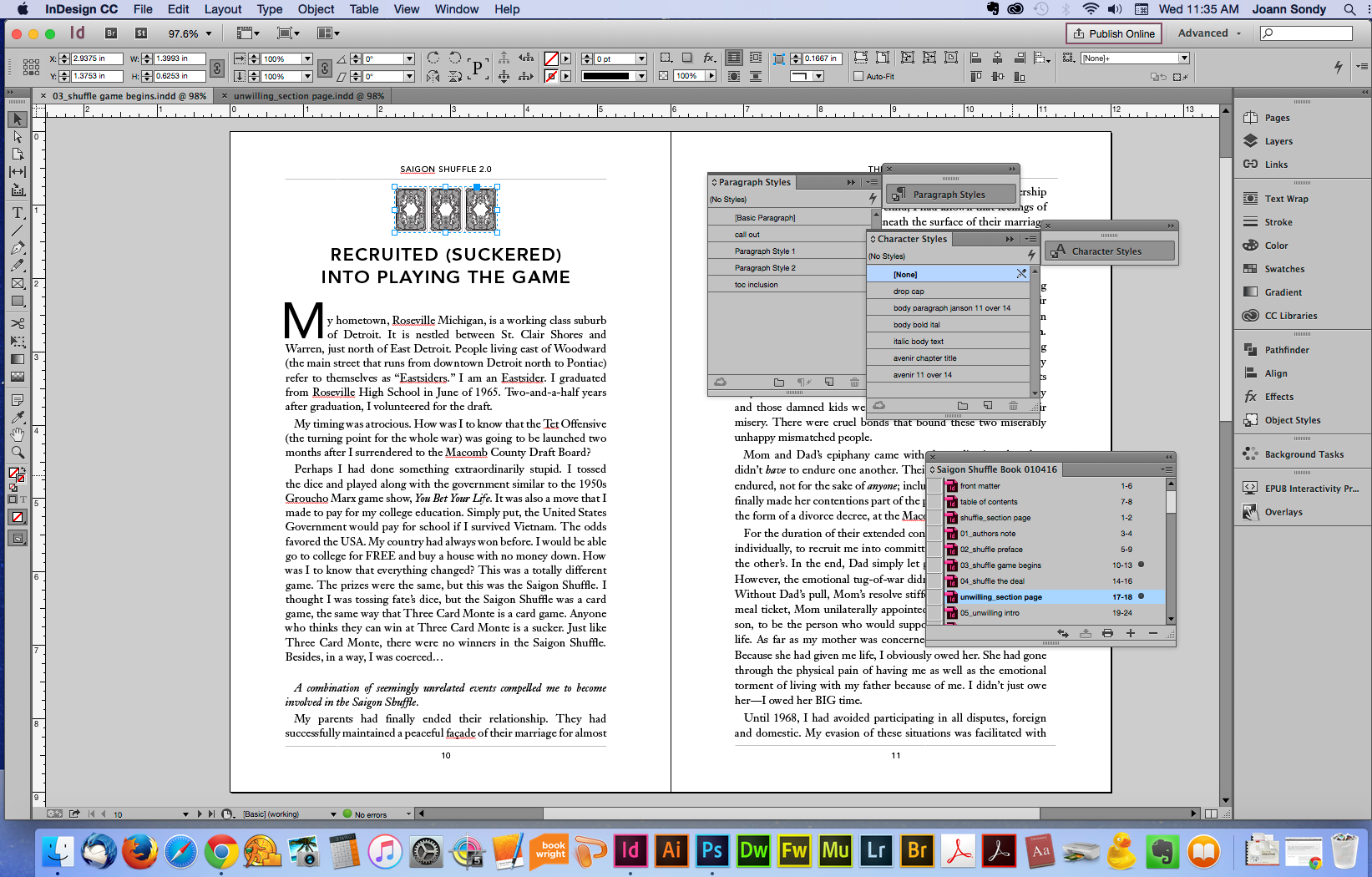
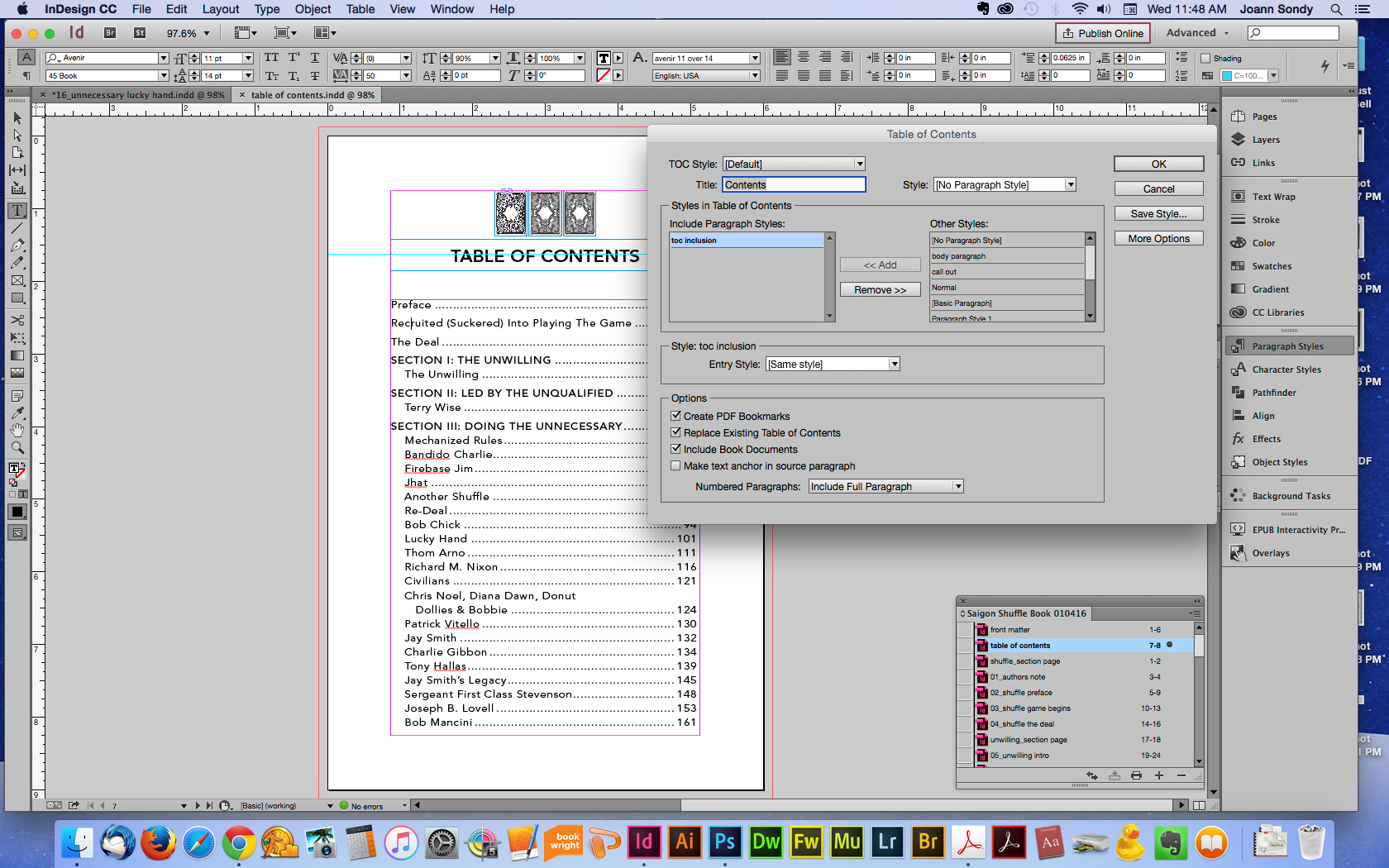
In addition to master pages, master styles are essential to achieving a high-level of design for each on every page. Defining the character styles first for body text and headlines creates the foundations for paragraph styles.
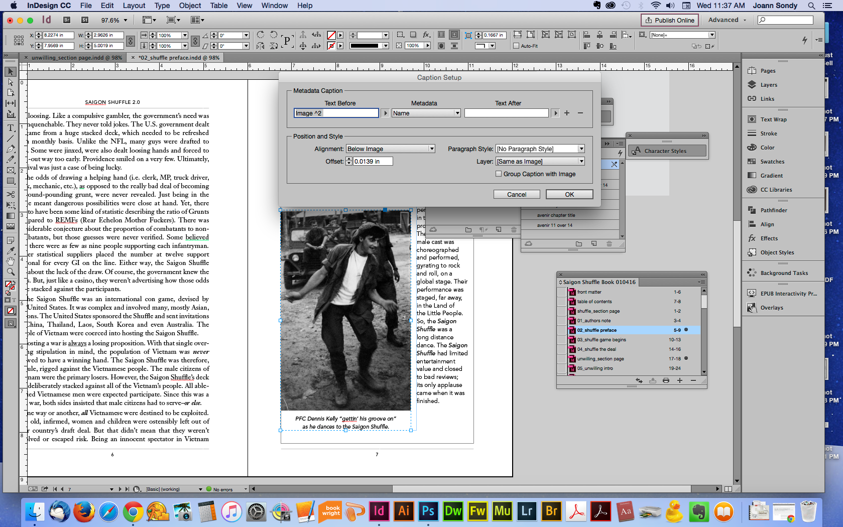
Just as I'm doing now with this image, adding a caption style once and applying when needed improves efficiency of production and design.
As a designer, I also employ the use of 'object' styles. Imperative since the author/photographer prefers a rule on every image frame.
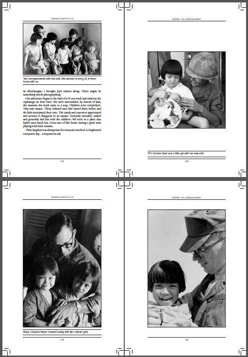
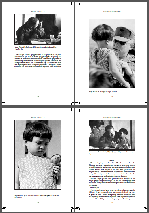
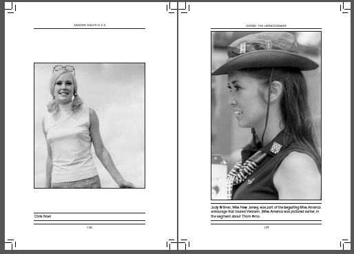
An example of how image sequencing and placement in this chapter added to the emotional story.
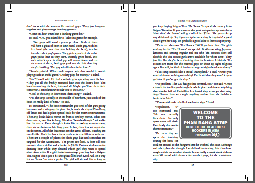
The creation of vector graphics like the "welcome" sign on the right-facing page was used to add visual break after pages and pages of continuous text.
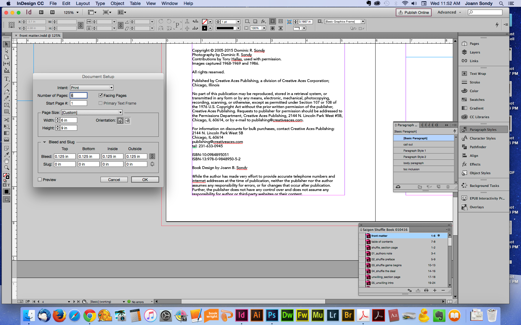
Page size dictated by CreateSpace options. The book size was altered during the early stages of layout from 7x10" to 6x9" which presented some challenges when content shifted.
Managing a 240+ book was simplified by using the "book" feature of Adobe InDesign.
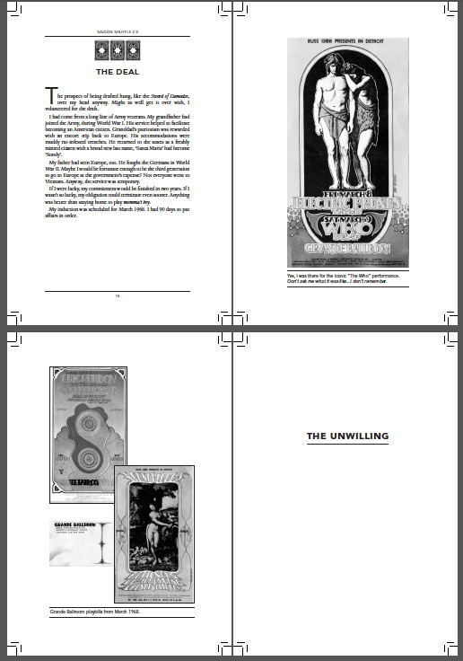
The inclusion of paraphernalia found when rooting through the archives added to the story and synced with actual events; plus whimsy. Note the use of white-space used to frame the handbills.
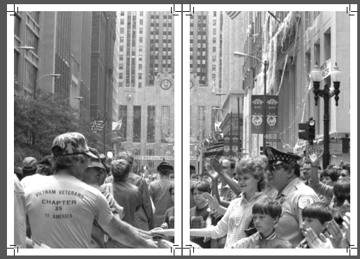
Working with double truck or full spread images when adhering to CreateSpace's specifications can be tricky. Each page has its own frame and the photo was split to retain the handshake.
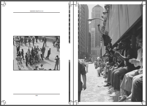
One of my favorite images in the book-- it had to be on a right-facing page.
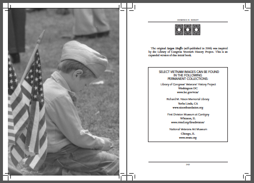
Also one of my favorite images in the book, this one is LAST and placed on left-facing page; both done purposefully.